The Flavor of Color: How to Use Color to Make Your Food Photos Pop
Color isn’t just decoration — it’s the secret ingredient that makes your food photos irresistible. It affects mood, appetite, and even the story your image tells.
Understanding color and how to use it thoughtfully will take your culinary photography from “nice” to “wow.”
1. Color Psychology in Food Photography
Colors evoke emotions and cravings. Warm hues like reds, oranges, and yellows tend to stimulate appetite and energy. Cooler tones — blues and greens — can refresh and calm.
- Red: evokes passion, warmth, appetite. Perfect for spicy dishes or juicy berries.
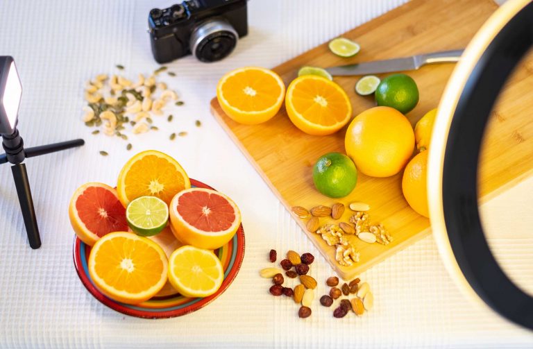
- Yellow: cheerful and vibrant — think fresh lemons or golden crusts.
- Green: freshness and health, great for salads and herbs.
- Blue: rare in food, but can add elegance or cool contrast.
Knowing this helps you choose plates, backgrounds, and props that amplify your dish’s mood.
2. Complementary Colors for Contrast
Using contrasting colors can make your subject stand out.
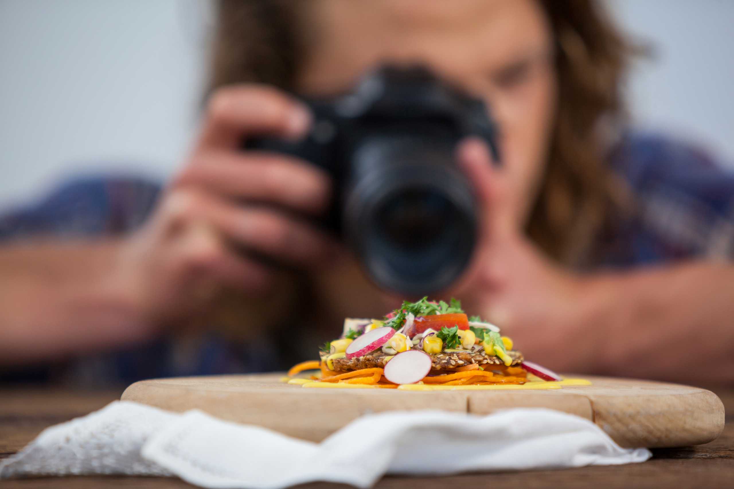
Example: a vibrant red tomato on a green plate, or bright yellow mango against a deep purple backdrop. These complementary color pairings create visual tension that draws the eye.
Try experimenting with colorful napkins, placemats, or garnishes to make your main dish pop.
3. Monochrome and Tonal Harmony
Sometimes less is more.
Choosing a monochrome palette — shades of one color — creates harmony and sophistication. It lets texture and shape do the talking.
For instance, a bowl of blueberries on a navy cloth with soft lighting creates a moodier, refined photo.
4. Avoid Color Clashes and Overload
Too many competing colors can confuse the viewer and distract from the food.
Keep your color palette simple — usually 2-3 dominant colors with subtle accents. Balance is key.
5. Adjusting Color in Post-Processing
Editing is where you can fine-tune and amplify your colors without losing authenticity.
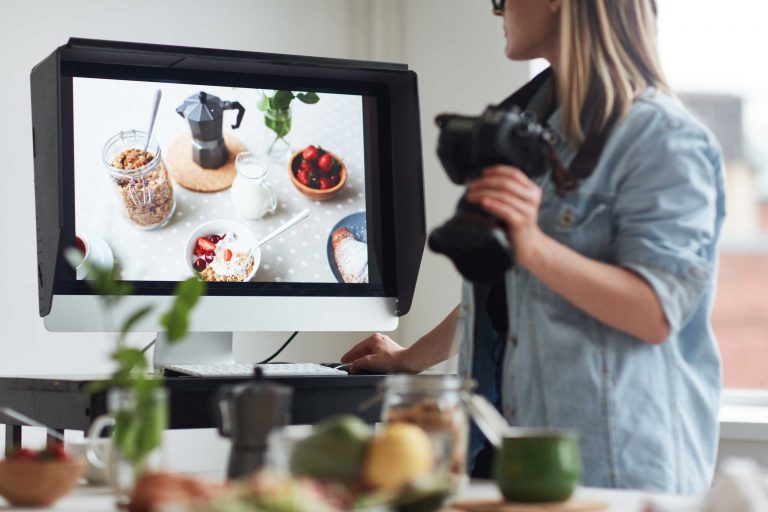
Boost saturation carefully, adjust white balance to keep tones natural, and use selective color correction to enhance key hues.
Avoid over-editing — it’s tempting, but can make food look artificial or unappetizing.
6. Use Natural Colors to Tell a Story
Sometimes the story is in the natural imperfections — the golden char on grilled vegetables, the blush on fresh fruit, the translucent glaze on a dessert.
Don’t over-filter or wash out these details. Celebrate the natural colors that make the dish unique.
In Summary
Color is your secret flavor booster in food photography.
When you thoughtfully combine hues, balance contrast, and celebrate natural tones, you create images that don’t just show food — they invite viewers to taste it with their eyes.


